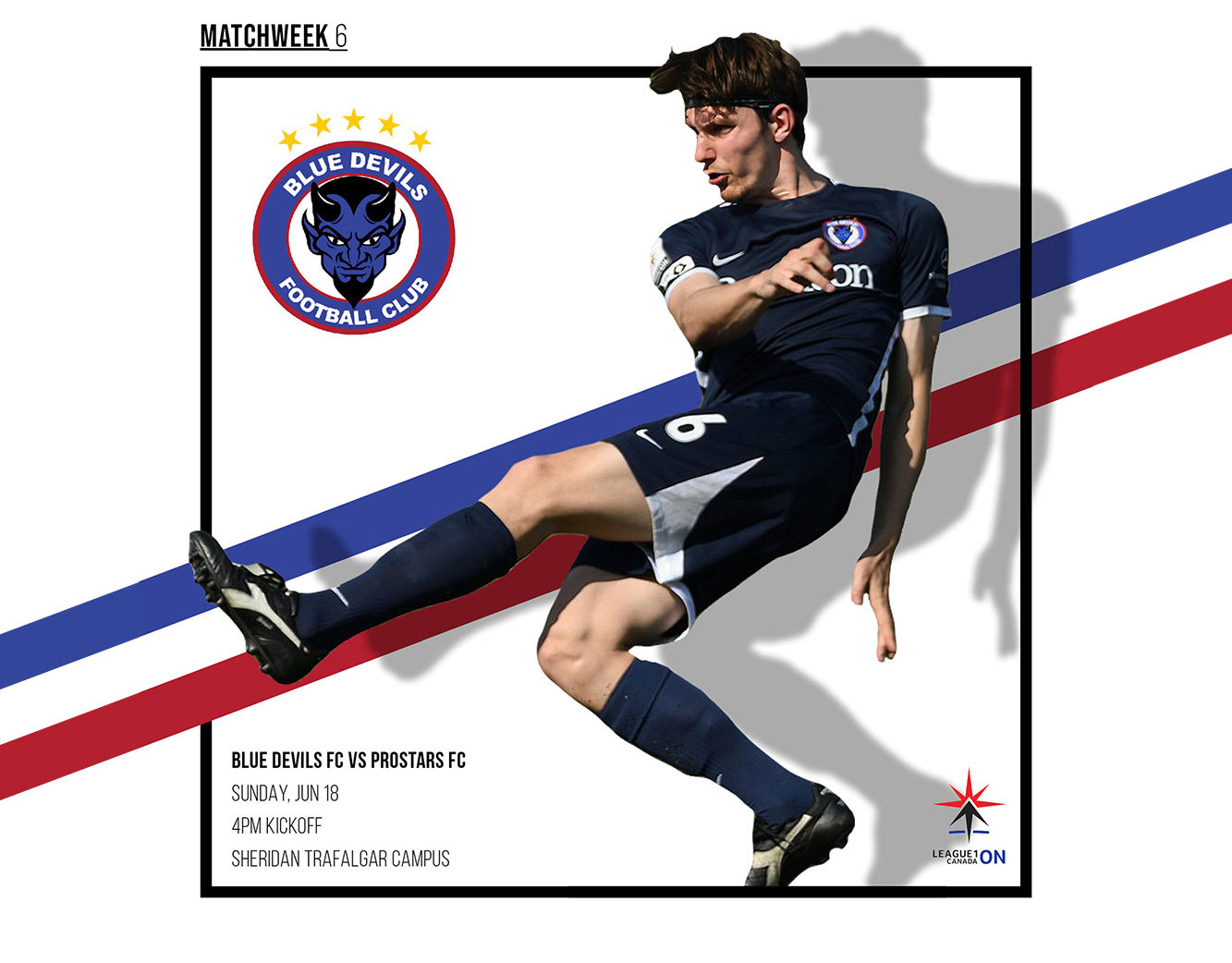
Leading visual identity, packaging, and promotional direction for a purpose-led community collaboration.
Focus
Mission-Driven Retail.
"True Blue Lager was a strategic exercise in turning a community mission into a retail-ready brand. I led the strategy to translate the Blue Devils Foundation's core values into a lifestyle product that connects emotionally with adult supporters. This initiative proves the power of purpose-led branding: driving measurable business growth while staying rooted in a 'giving back' philosophy."
Business Context
The foundation sought new ways to increase visibility, engage adult supporters, and create a tangible product that could translate community support into sustainable fundraising. The challenge was to develop a brand identity that felt authentic within craft beer culture while maintaining a strong connection to the foundation’s purpose.
My Role
I led brand strategy and creative direction for the product launch, translating the foundation’s mission into a retail-ready identity that could compete within Ontario’s craft beer market while extending the Blue Devils brand into a lifestyle context.
Creative Strategy
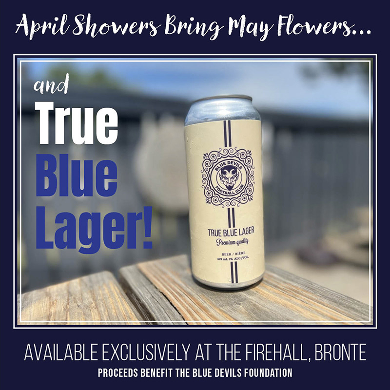
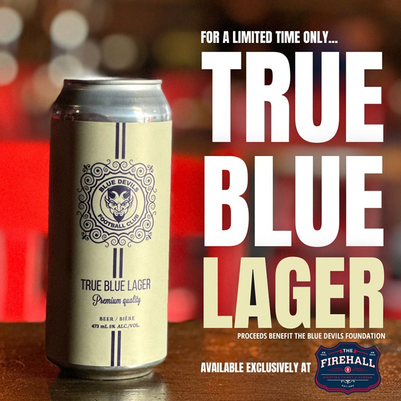
The identity was designed to balance craft authenticity with club pride and purpose. The visual language drew from heritage brewing aesthetics while incorporating a bold, confident tone that reflected the energy of youth sport and the Blue Devils’ mission.
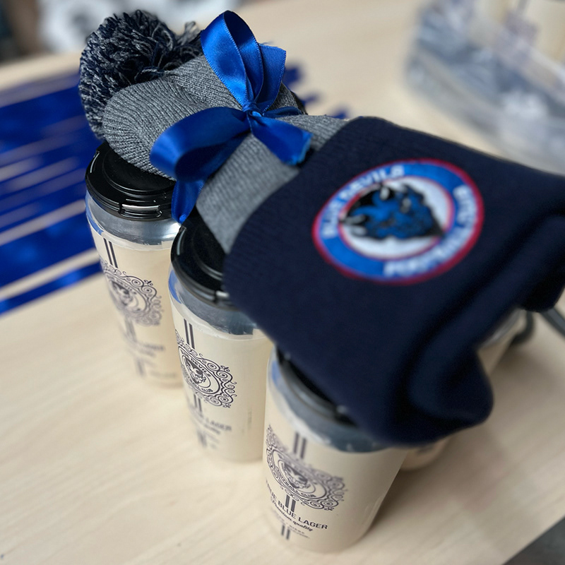
Rather than presenting the lager as just merchandise, the design positioned it as a symbol of community support, connection, and shared belief in youth potential — aligning product experience with charitable impact.
Scope of Direction
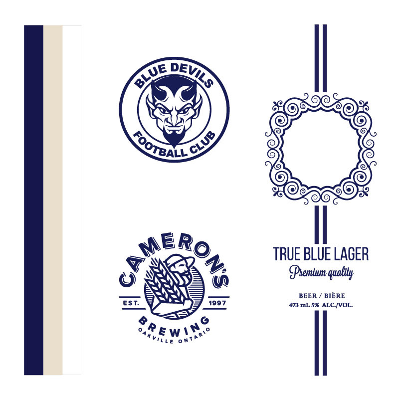
• Brand identity concept and visual system
• Logo and emblem design
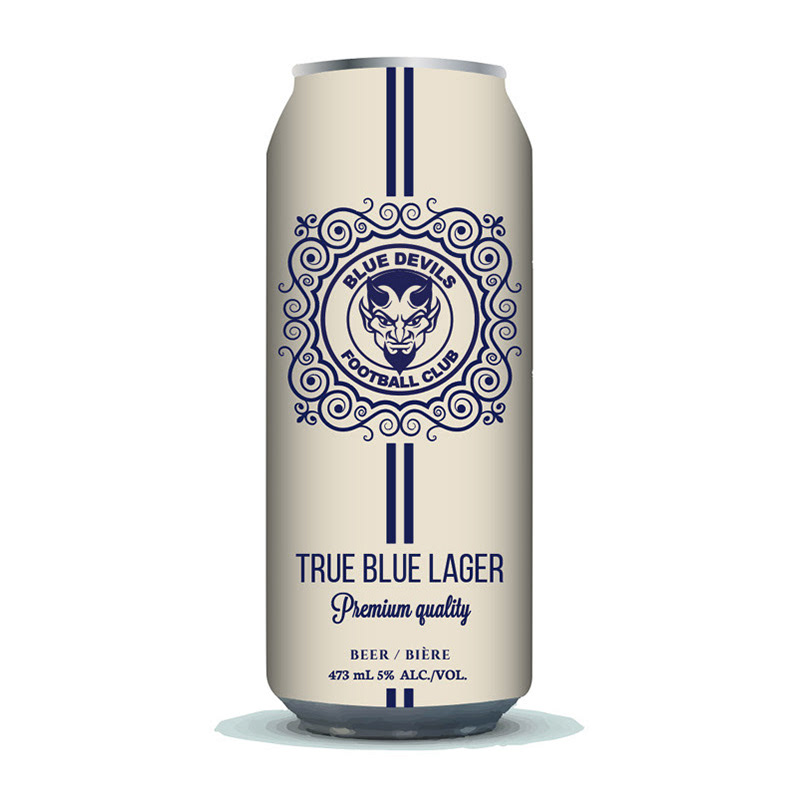
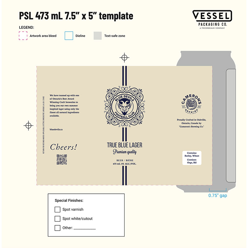
• Packaging and label design
• Typography and graphic language
• Art direction for product presentation and promotional visuals
• Logo and emblem design
• Packaging and label design
• Typography and graphic language
• Art direction for product presentation and promotional visuals
Outcome
The final product established a meaningful lifestyle extension of the foundation’s brand, strengthening community visibility and supporting fundraising efforts through a purpose-driven retail experience.
Brand Identity
Packaging Design
Brand in Context